Usage

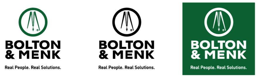
The Bolton & Menk logo consists of the circle/tripod graphic, our name in its customized font style, and the tagline, “Real People. Real Solutions.”

Color

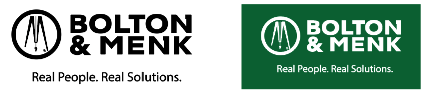
The color version of the logo is always preferred when color is an option. It must be produced with the color formulas listed here.

Bolton & menk logo full color

PMS #349

CMYK values: C90 M12 Y95 K40

RGB values: R0 G105 B56

Hexadecimal (web use): 006938
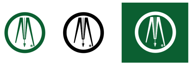
Black

CMYK values: C0 M0 Y0 K100

RGB values: R0 G0 B0

Hexadecimal (web use) 000000

Black

The black (or grayscale) version should be used only when color is not available.

Bolton & menk logo grayscale

Black

CMYK values: C0 M0 Y0 K100

RGB values: R0 G0 B0

Hexadecimal (web use) 000000

White

The logo should appear in all white when it must be used on black or dark colored backgrounds.
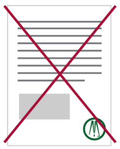
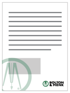
Bolton & menk logo reversed

Clear Space

White space is important to help separate the logo from other visual elements and to help give it visual importance. Maintain a minimum clear space around the logo equal to the circle’s radius. Never allow any other graphics or type to invade the clear space.

Bolton & menk logo clear space example

Minimum Size

The logo is designed to reproduce well at almost any size. However, to ensure that it is legibly and accurately reproduced, the logo may not be printed or otherwise used in a size smaller than 1” horizontally. EPS (vector art) should be used when scaling.

To maintain legibility, the tagline should not be printed smaller than 6pt. type. If the tagline gets smaller than 6pt. type or is illegible, drop the tagline.

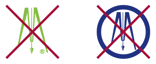
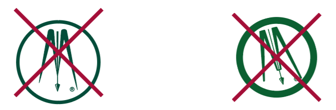
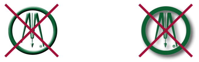
The Bolton & Menk letter forms and circle tripod graphic have been custom designed. Both the text and the graphic are unique. Do not attempt to redraw or recreate them.

Bolton & menk logo minimum size example

Download Official Logos

Avoiding Common Mistakes

Avoid these common errors that can have adverse effects on the logo and ultimately damage our brand.
Logo usage, do not stretch logo
Do not stretch or squish the logo.
Logo usage, do not alter the official colors
Do not change or modify the logo colors.
Logo usage, do not rearrange or change logo elements .
Do not rearrange or change logo elements. Do not rotate the logo.
Logo usage, do not add effects like bevels or shadows
Do not add effects like bevels or shadows.

Logo Alternates

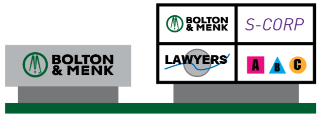
The standard version of the logo is always preferred and should be used whenever possible. However, we recognize that there are times when exceptions are necessary.

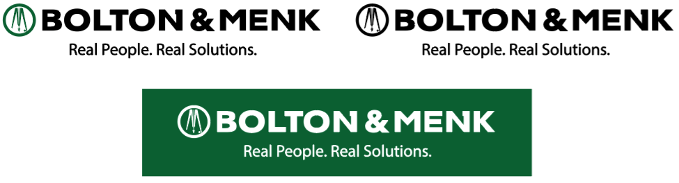
The following logo options may only be used when space is restricted to an extreme horizontal or vertical space where the standard logo would not be legible or grossly undersized compared to the available space.

If changing the space limitations is not possible, request approval from the marketing or creative studio work group to use one of the versions below:

Horizontal version
Logo usage, showing layout of horizontal logo.
Vertical/stacked version
Logo usage, showing layout of vertical logo.

Below are some examples of when the alternate logos should and should not be used.

INCORRECT
Because the legibility of the logo would be compromised by the small size (less than 1 inch).
A white golf ball with a red X across it. The text BOLTON & MENK and Real People. Real Solutions. is visible in bold black letters, along with a circular design, in the center of the ball.
CORRECT
The tagline may be removed if the size would cause it to be smaller than 6pt type.
A white golf ball featuring the Bolton & Menk logo, which includes a green circle with stylized letters M inside and the companys name in bold black font below.
INCORRECT
Because the legibility of the logo would be compromised by the small size (less than 1 inch).
A gray and black cylindrical object with a red X over the logo BILLION & FINK in green and black text. The object has a gray tip on one end.
CORRECT
The tagline may be removed if the size would cause it to be smaller than 6pt type.
A gray pencil with a sharpened graphite tip. BOLTON & MENK is printed in black letters alongside a green logo featuring stylized initials BM.
INCORRECT
Even though the space is more square, the standard logo lockup would be large enough to read. Preference is always given to the standard logo.
A mug with a logo featuring a green circle and abstract design above the text Bolton & Menk. Below, it reads Real People. Real Solutions. A red X is marked over the design.
CORRECT
A white mug featuring the Bolton & Menk logo in black text with a green circle enclosing a stylized M. Below, the slogan reads Real People. Real Solutions. The mug is positioned handle to the right.
A green logo featuring a circle with a stylized pair of compasses inside, forming the letter M. Theres a small registered trademark symbol at the bottom right of the compasses.

Circle/tripod

The tripod is an important and recognizable graphic element and visual link to our history.

Two gray sweaters with logos; the left sweater has a small circular green logo on the chest, marked OK in green. The right sweater has a small green logo with BOLTON & MENK text, also marked OK.

The circle/tripod is not the logo.

The circle/tripod graphic may not be used as a replacement for the complete logo.

A document icon with a red X over it, indicating negation or cancellation. The bottom right corner has a green circle with a stylized pen logo inside.
INCORRECT
The circle/tripod must be accompanied by the Bolton & Menk logo.
A document layout with lines resembling text in the upper section, a gray rectangular box in the center, and the Bolton & Menk logo in the bottom right corner. The logo features a circular design element and the company name.
CORRECT
Because the Bolton & Menk logo is present.

Avoiding Common Mistakes

Avoid these common errors that can have adverse effects on the logo and ultimately damage our brand.
Two green logos with drafting tools inside green ovals. The left logo has a red X over it with gray arrows implying no vertical movement. The right logo lacks the red X and gray arrows suggest vertical movement is allowed.
Do not stretch or squish the circle/tripod graphic.
Two geometric logos, one green and one blue, each depicting a stylized compass, are crossed out with red X marks. The blue logo is enclosed in a blue circle.
Do not change or modify the colors.
Two similar green circular logos with stylized pens are crossed out with red X marks. The logo on the left has thicker lines, while the logo on the right is simpler with thinner lines. Both are set against a white background.
Do not redraw or change the appearance of the tripod or circle. Do not tilt or angle the tripod.
Two circles with stylized arrows inside. The left circle has a red X over it. The right circle has no markings over it. Both circles have green outlines and arrows.
Do not add effects like bevels or shadows.
A small bridge with stone supports stands on the left, with trees and rocks surrounding it. A colorful rainbow gradient fills the right side. A large red X overlays the image, intersecting a green circle with letters inside.
Avoid busy backgrounds with multiple colors, gradients, photos, patterns, or pictures.

Promotional Items

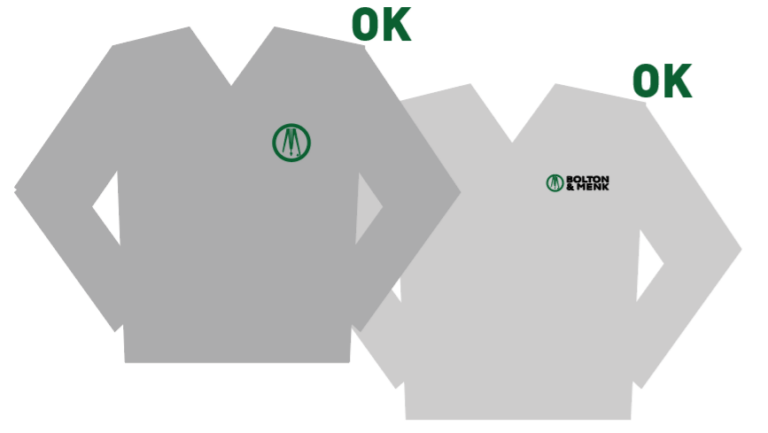
Promotional/giveaway items can be an effective medium to increase awareness of the Bolton & Menk brand. They help build top-of-mind awareness by placing the logo in everyday situations in the lives of clients and potential clients.

Traditionally, promotional items include pens, mugs, desk objects, golf balls, can coolers, caps, apparel, trade show giveaways, etc.

Promotional items should include the standard Bolton & Menk logo only. No other product or company logos should be present unless the co-branding is approved by the marketing or creative studio work groups.

All promotional items must be purchased or coordinated through the Marketing work group.

When ordering promotional items

  • Use original artwork from the Creative Studio
  • Choose items whose base colors to match primary brand colors whenever possible (PMS 349 green, white, gray, black)
  • Use approved colors for logo production:
    • Pantone 349 and black (whenever possible)
    • White (for use on green and darker colored items)
    • 100% black
  • Follow logo clear space requirements
  • Use vector art unless otherwise specified by the vendor
  • Size the logo appropriately—contact the Creative Studio work group for artwork or with any questions
  • Choose items that complement the Bolton & Menk brand personality
  • Choose items that are audience or culturally appropriate

The full standard logo in Bolton & Menk green and black is always preferred and should be used whenever possible.

Logo with Bolton & Menk in bold black letters. A green and white circle with geometric shapes appears to the left. Below, the text reads: Real People. Real Solutions.

Preferred

Two Bolton & Menk logos side by side. The left logo is black and white with the text BOLTON & MENK above Real People. Real Solutions. The right logo is green and white with the same text and a circular emblem.

If full color is not an option, the options shown here are acceptable on promotional items.

Three drafting compass icons: the first inside a green circle, the second inside a black circle, and the third on a green square background with a white circle. Each compass is stylized and facing downward.

Circle/Tripod – APPAREL ONLY

Three variations of the Bolton & Menk logo are shown, each with the text Real People. Real Solutions. Two logos are on a white background and one on a green background, all featuring the Bolton & Menk name and circular emblem.

Horizontal Alternate – LIMITED USE

Three versions of the Bolton & Menk logo. The first is a green circle, the second a black circle, and the third on a green square background. Each shows white engineering tools with the text BOLTON & MENK: Real People. Real Solutions.

Vertical Alternate – LIMITED USE

Signage

For exterior building signage and pylon/standalone/back lit signs, the standard logo must be displayed in Bolton & Menk green (Pantone 349) and black. If sign restrictions limit the color, the all black version should be used. If sign restrictions require a color other than black, white, or gray, simply the text “Bolton & Menk” should be displayed (not in the logo font) and the full standard logo should be placed on the most prominent door and/or wall available.

Illustration of a gray building facade with six rectangular windows and a central door. The logo and text Bolton & Menk are displayed on the upper portion of the building.

Building Exterior

Illustration showing two structures: a gray sign with Bolton & Menk and a four-panel board. Panels display Bolton & Menk, S-Corp, Lawyers (crossed out), and ABC (with colored triangles and circle).

Monument/Pylon/Back-lit

Illustration of an office lobby with a reception desk, door, and a copy machine. The wall features the Bolton & Menk logo and the tagline Real People. Real Solutions.

Interior Signage