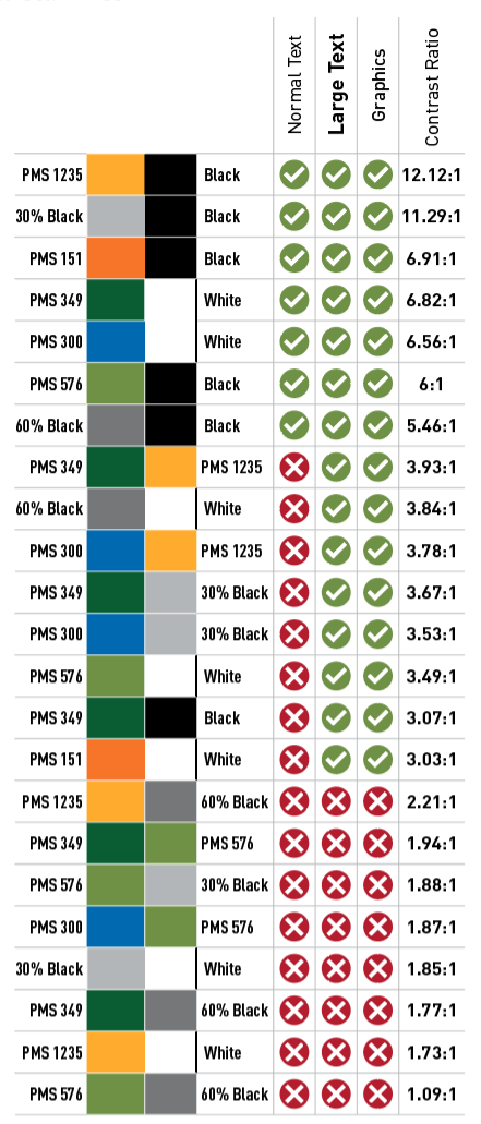
To ensure that our materials are accessible and usable to the widest audience possible, following are some common brand color combinations showing their contrast ratio and whether or not they meet ADA accessibility standards for text and graphics according to: https://webaim.org/resources/contrastchecker/
Web Content Accessibility Guidelines (WCAG) 2.0 level AA requires a contrast ratio of at least 4.5:1 for normal text and 3:1 for large text. WCAG 2.1 requires a contrast ratio of at least 3:1 for graphics and user interface components
Communicating Information
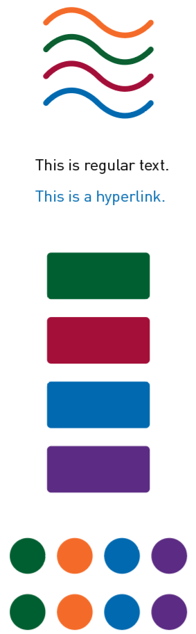
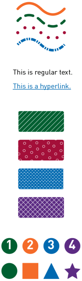
Color should not be the only means of differentiating similar information. The use of line styles, type treatments, patterns, shapes, etc. help people with and without sight impairments perceive differences in information more clearly.
Our core philosophy is that all people should live in safe, sustainable, and beautiful communities. To that end, we want to ensure our company materials—including proposals, advertisements, and presentations—reflect this by being accessible and usable to all people.
Our clients and audiences have different abilities and needs, so it’s important to be aware of ways we can create content that all reviewers can perceive, navigate, and understand. Many of our clients are placing greater emphasis on accessibility as well—a proposal or advertisement might be our first opportunity to show off our knowledge of designing accessible materials and to demonstrate that we value accessibility too.
Some software programs and applications have tools to help check a document’s accessibility. Find out if the software you use does, and use those tools whenever possible. In addition, here are a few general guidelines that are helpful to make any document accessible:
Contrast Contrast is the difference in color between text, a logo, or an image and the background color of the page. A good practice is to use high contrast to distinguish these elements on a page, or a contrast ratio of at least 4.5:1.
Large text can have a lower contrast ration of at least 3:1. Large text is defined as:
A minimum of 14 point (typically 18.66 pixels) and bold or larger
18 points (typically 24 pixels) or larger
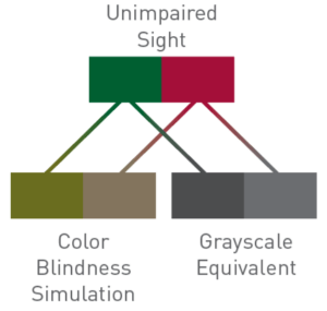
Here is an example of how colors can look to someone with a color vision deficiency. Converting colors to grayscale or printing them in black and white can help visualize how much contrast colors have.
Color Contrast Checkers To find the contrast ratio between two colors and determine whether they meet WCAG accessibility requirements, visit:
Compliance Statement Whenever possible, the following statement should be included on branded materials; this language tells reviewers or other readers that we will accommodate those who require an ADA accessible format:
This document is available in accessible formats. Please contact [Name] at first.last@bolton-menk.com for assistance.
The statement must be on its own line, separated from the surrounding text. It should have a high contrast ratio and be distinguishable from other text.
If someone requests an ADA-accessible document, or a document that better meets their specific needs, please reach out to Eric Wenz (eric.wenz@bolton-menk.com) and Aaron Tish (aaron.tish@bolton-menk.com) for assistance designing an ADA-compliant document.
Just like color combinations, choosing a simple, readable typeface can help make communication easier. Font choice can affect how readers perceive text on a page. ADA-compliant fonts are those that low-vision readers can understand. DIN is our brand standard typeface. However, Calibri is an acceptable substitute if DIN is not availabe on your computer. Both are simple, easy to read, and Calibri is available on most devices.
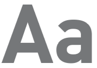
Sans serif typefaces are among the easiest to read. Because they have few visual distractions, they have a high readability.
With their decorative extensions Serif typefaces are familiar, but slightly less readable to people with visual impairments, including common near- and far-sightedness.
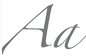
Script fonts with thick and thin lines and flourishes can be beautiful, but lower readability is often a trade-off. When using, choose options faces that are easier to read and use them sparingly for decorative elements, large titles, etc.
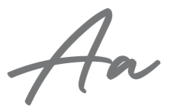
Handwritten-style typefaces can add personality and tone to a designed piece, but they can also add a degree of difficulty when it comes to readability. Use sparingly, at large sizes and with high contrast colors.
Decorative or distressed typefaces are less readable for people with and without sight impairments and should not be used for critical information. They may be used large in decorative titles/headlines, as decorations, or design elements.